A Flux query for InfluxDB to generate average electricity usage per hour by weekday
After further learning with Flux and thinking about how to extract what I wanted from it (in my other post), I finally managed to figure out how to generate average hourly electricity consumption by weekday using only a Flux query.
Assumptions:
- The data is already regularly timed. e.g. every 30 minutes (which is what I download from my energy provider). If not, you would need to add something like
aggregateWindow(every: 1h, fn: sum)into your query before the pivot to make it so. - This query does all the processing in realtime, meaning that it has to be crunched every time it loads. On my Raspberry Pi InfluxDB instance, it takes about 10 seconds to do 60 days of data. You might want to push it to the bottom of your dashboard so that Grafana only loads it if you scroll down that far.
- I’m still learning the best ways to write queries with Flux, so there might be a tidier way of doing things.
Source data
Given the electricity usage data structure like this…
| _time | usage_amount |
|---|---|
| 2024-01-01T10:00:00.000Z | 0.13 |
| 2024-01-01T10:30:00.000Z | 0.32 |
| 2024-01-01T11:00:00.000Z | 0.18 |
… etc
Output data
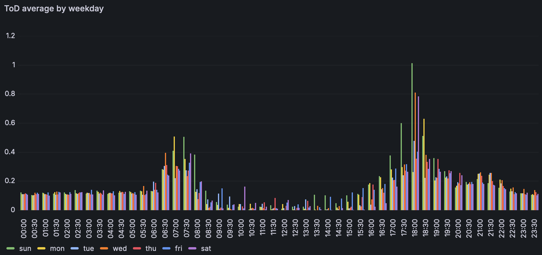
The script below will turn it into this…
| timeofday | sun | mon | tue | wed | thu | fri | sat |
|---|---|---|---|---|---|---|---|
| 00:00 | 0.0 | 0.11 | 0.0 | 0.0 | 0.0 | 0.0 | 0.0 |
| 00:30 | 0.1 | 0.30 | 0.1 | 0.2 | 0.1 | 0.2 | 0.1 |
| 01:00 | 0.0 | 0.14 | 0.0 | 0.0 | 0.0 | 0.0 | 0.0 |
… etc
The query
import "timezone"
import "date"
import "internal/debug"

// set the timezone to my local timezone to make sure things match up
option location = timezone.location(name: "Australia/Melbourne")

// this method gets the amount of use at the expected day. If day doesn't match, return null.
getWeekdayAmount = (time, expectedDay, value) => {
  return if date.weekDay(t: time) == expectedDay then value else debug.null(type: "float")
}

// this method pretty format just the hour and minute
getFormattedTime = (time) => {
  hour = date.hour(t: time)
  minute = date.minute(t: time)
  formattedHour = if hour < 10 then "0" + string(v: hour) else string(v: hour)
  formattedMinute = if minute < 10 then "0" + string(v: minute) else string(v: minute)
  return formattedHour + ":" + formattedMinute
}

// this method groups the time and usage amount, then gets the mean. Then ungroups back to a single table.
groupAndMean = (table=<-, columnName) => table
    |> group(columns: ["timeofday"])
    |> mean(column: columnName)
    |> sort(columns: ["timeofday"])
    |> group()

// chainable join method
joinChain = (table=<-, table2) => {
  return join(tables: { t1: table, t2: table2 }, on: ["timeofday"])
}

// get all the data and map each column to have only values for that day at that time.
baseData = from(bucket: "electricity")
  |> range(start: v.timeRangeStart, stop: v.timeRangeStop)
  |> filter(fn: (r) => r["_measurement"] == "usage")
  |> filter(fn: (r) => r["_field"] == "usage_amount")
  |> pivot(
       rowKey:["_time"],
       columnKey: ["_field"],
       valueColumn: "_value"
  )
  |> map(fn: (r) => ({ r with timeofday: getFormattedTime(time: r._time) }))
  |> map(fn: (r) => ({ r with sun: getWeekdayAmount(time: r._time, expectedDay: 0, value: r.usage_amount) }))
  |> map(fn: (r) => ({ r with mon: getWeekdayAmount(time: r._time, expectedDay: 1, value: r.usage_amount) }))
  |> map(fn: (r) => ({ r with tue: getWeekdayAmount(time: r._time, expectedDay: 2, value: r.usage_amount) }))
  |> map(fn: (r) => ({ r with wed: getWeekdayAmount(time: r._time, expectedDay: 3, value: r.usage_amount) }))
  |> map(fn: (r) => ({ r with thu: getWeekdayAmount(time: r._time, expectedDay: 4, value: r.usage_amount) }))
  |> map(fn: (r) => ({ r with fri: getWeekdayAmount(time: r._time, expectedDay: 5, value: r.usage_amount) }))
  |> map(fn: (r) => ({ r with sat: getWeekdayAmount(time: r._time, expectedDay: 6, value: r.usage_amount) }))
  |> keep(columns: ["timeofday", "sun", "mon", "tue", "wed" , "thu", "fri", "sat"])

// remove nulls and group to get the average
// need to do the filter here rather tan in the groupAndMean method because I can't get Flux to work with the column name as a parameter
sun = baseData
  |> keep(columns: ["timeofday", "sun"])
  |> filter(fn: (r) => r.sun >= 0)
  |> groupAndMean(columnName: "sun")

mon = baseData
  |> keep(columns: ["timeofday", "mon"])
  |> filter(fn: (r) => r["mon"] >= 0)
  |> groupAndMean(columnName: "mon")

tue = baseData
  |> keep(columns: ["timeofday", "tue"])
  |> filter(fn: (r) => r["tue"] >= 0)
  |> groupAndMean(columnName: "tue")

wed = baseData
  |> keep(columns: ["timeofday", "wed"])
  |> filter(fn: (r) => r["wed"] >= 0)
  |> groupAndMean(columnName: "wed")

thu = baseData
  |> keep(columns: ["timeofday", "thu"])
  |> filter(fn: (r) => r["thu"] >= 0)
  |> groupAndMean(columnName: "thu")

fri = baseData
  |> keep(columns: ["timeofday", "fri"])
  |> filter(fn: (r) => r["fri"] >= 0)
  |> groupAndMean(columnName: "fri")

sat = baseData
  |> keep(columns: ["timeofday", "sat"])
  |> filter(fn: (r) => r["sat"] >= 0)
  |> groupAndMean(columnName: "sat")

// combine each day into a single table.
sun
  |> joinChain(table2: mon)
  |> joinChain(table2: tue)
  |> joinChain(table2: wed)
  |> joinChain(table2: thu)
  |> joinChain(table2: fri)
  |> joinChain(table2: sat)
  |> sort(columns: ["timeofday"])
Displaying the data
To display the generated data in a Grafana visualisation, I’m using a bar chart, because that will accept an arbitrary string value for the x-axis. It would be nice to be able to display it as lines rather than bars, but it’s a good start.
I hope this has been helpful. Thanks for reading. :-)