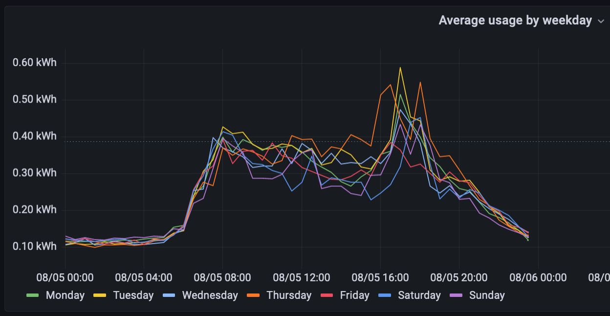
A Grafana panel to show average electricity usage per hour by weekday
Update: May 2024
After a lot of playing around with Flux, I managed to work out how to do this by week entirely in a single query from the usage data. Click here to go to that post.
I’ve been tracking my electricity usage using InfluxDB and Grafana (with a custom .Net 5 data scraper) for a little while now and it looks very pretty, but there was one graph that I couldn’t figure out how to do. In Excel, I can manipulate the data to get average usage per hour by weekday and month, but until now, I was struggling to make it work in Grafana.
When I save the data into InfluxDB, I add some extra columns to make it easier to extract the average data. Shown below is the c# class that I use to push the data into InfluxDB using InfluxDB.Client. You can see I’m adding the day of the week and the month of the year which will help with the query later.
using InfluxDB.Client.Core;

namespace Example
{
    [Measurement("usage")]
    public class Usage
    {
        [Column("weekday")]
        public string Weekday => LocalTime.ToString("dddd");
        [Column("month")]
        public string Month => LocalTime.ToString("MMMM");
        [Column("daytime")]
        public string DayTime => LocalTime.ToString("HH:mm");

        [Column("usage_amount")]
        public double UsageAmount { get; set; }

        public DateTime LocalTime { get; set; }

        [Column(IsTimestamp = true)]
        public DateTime Time => LocalTime.ToUniversalTime(); //InfluxDB requires UTC times.
    }
}
After many attempts and failures at getting the data that I could see in InfluxDB to appear as a pretty chart in Grafana, I finally had a breakthrough when I conceded that Grafana MUST have a time to apply to the series, even if it’s a made up time.
This is the query I ended up with to get the data needed.
(Here’s a picture because Jekyll doesn’t support Flux syntax.)
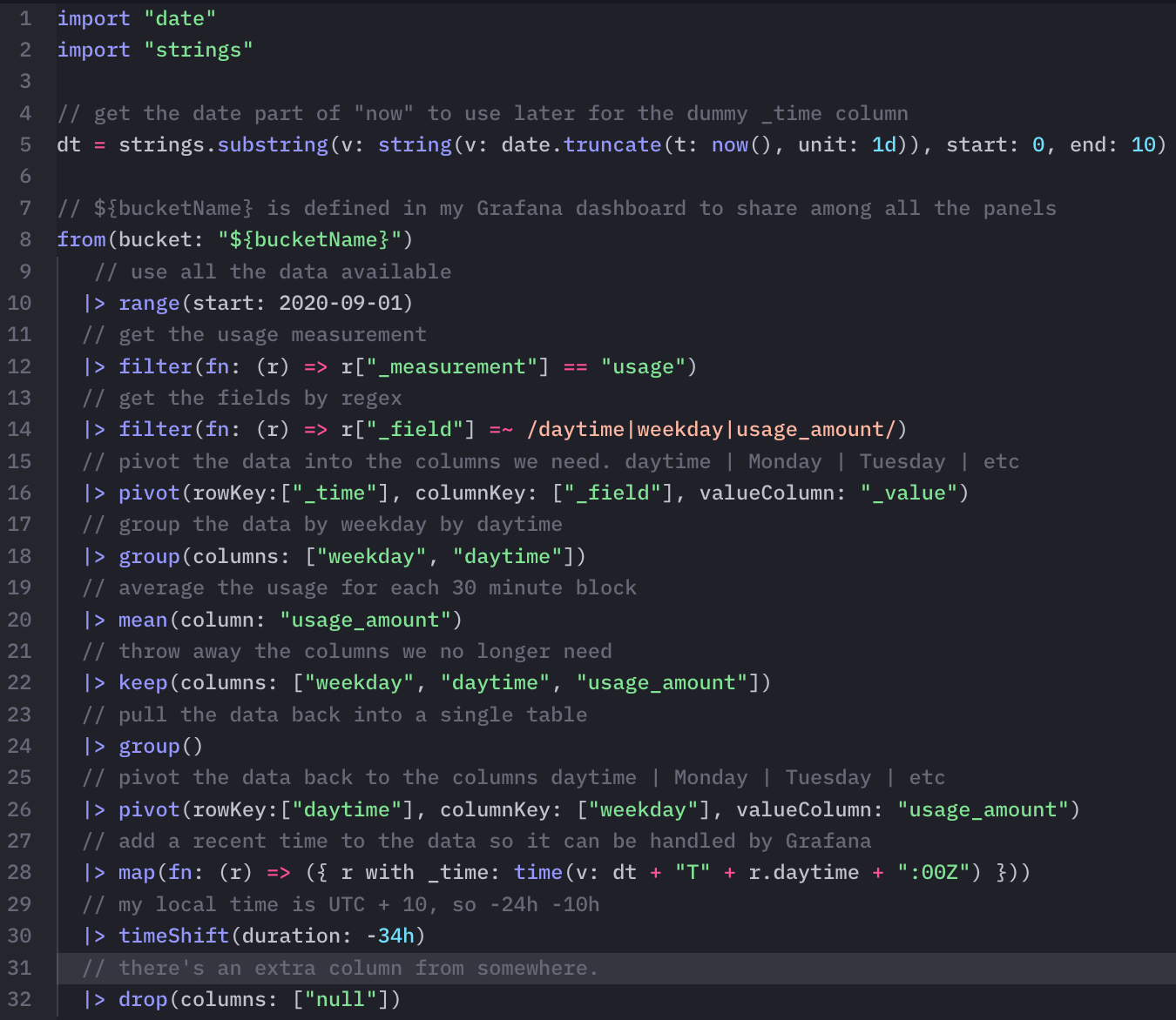
And the query ready for quick copy-pasta. (It’s highlighted as F#, which looks OK, but it’s actually Flux)
import "date"
import "strings"
dt = strings.substring(v: string(v: date.truncate(t: now(), unit: 1d)), start: 0, end: 10)
from(bucket: "${bucketName}")
|> range(start: 2020-09-01)
|> filter(fn: (r) => r["_measurement"] == "usage")
|> filter(fn: (r) => r["_field"] =~ /daytime|weekday|usage_amount/)
|> pivot(rowKey:["_time"], columnKey: ["_field"], valueColumn: "_value")
|> group(columns: ["weekday", "daytime"])
|> mean(column: "usage_amount")
|> keep(columns: ["weekday", "daytime", "usage_amount"])
|> group() // pull the data back into a single table
|> pivot(rowKey:["daytime"], columnKey: ["weekday"], valueColumn: "usage_amount")
|> map(fn: (r) => ({ r with _time: time(v: dt + "T" + r.daytime + ":00Z") }))
|> timeShift(duration: -34h)
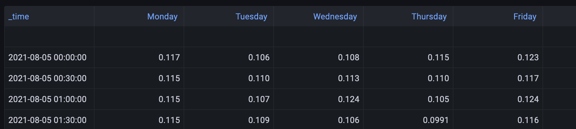
|> drop(columns: ["null"])Assuming you already have a Flux connection in Grafana to the InfluxDB instance where the data is stored, you should be able to see the data in Table View in Grafana. The chart view might not show anything yet because the time range might not match the selected range for the dashboard.
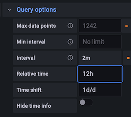
There are a few tweaks required on the panel in Grafana to get the data to display correctly.
- On the transforms tab (next to query), choose Organize Fields which will allow for sorting the columns in a custom order so that the days of the week are in order.
- In the query options, set the relative time to 12h and the time shift to 1d/d. This will ensure that the chart always shows a single day of data and keeps the frame aligned. (More or less, I haven’t perfected this yet.)
Here’s the final result.
Now go back and replace “weekday” with “month” in the query and you can do the same for average usage per hour by month.
I hope this has been helpful. Thanks for reading. :-)